Adobe Released a Collection of Earth Day Stock Photos…
Here’s What Climate Designers Have to Say About It
Adobe claims to change the world through personalized digital experiences, and as a premier software tool for creatives and storytellers of all kinds, the impact they have on the world is real.
One of their many vectors of influence is the stock imagery hosted on their platform. In the age of generative AI, it’s safe to assume any graphical content published on the internet will influence the creation of new narratives in some way.* Stock images, intended to be licensed and published by dozens to millions of people, can have an exacerbated effect.
What’s Trending for Earth Day?
Adobe's Earth Day collection, released at the start of this month, is therefore a ‘marble and sculptor’ of environmental messaging. The four most common terms used in stock titles were:
Renewable energy.
Environmental conservation.
Eco-friendly lifestyle.
Sustainability.
And the most common image themes included:
To gain some insight into the risks and opportunities around Earth Day imagery and understand how we can use powerful graphics to design a more sustainable future, I reached out to my friend Valerie Morrice—who also happens to be a member of Climate Designers.
Merging our insights, I’ll take you on a journey of joint commentary on these photos from the collection—on a scale from diligent to deceitful—to guide future sustainability stock users and content consumers.
(Please keep in mind that these comments should be taken with a grain of salt, as they are generalized and do not consider the specific use-case of the image.)
Earth Day Stock Archetypes
1. For The Environmental Engineer
This category of stock appeals to the nerds—but it should be used universally. If a company has a sustainable design team or provides value with waste reduction, energy efficiency, or any other environmental impact in mind, technology-based stock can help demonstrate leadership and innovation without giving away any ‘secret sauce.’ Images in this camp also invoke curiosity about how product design impacts the planet, opening the gate to consumer education.
From a design perspective, these images lean into ‘climate sci-fi core,’ which is captivating and trendy. ‘A’ marks for marketers using blueprint-adjacent imagery similar to the following:

2. For The "Slap a Solar Panel on It" Guy
Closely related to the "Add an EV to It" Guy, this archetype depicts something directly linked to environmental impact or ESG in the hyper-generic sense. While these images might initially activate your greenwashing radar, I can imagine them coming in handy when talking about corporate responsibility projects, such as a plan to increase on-site generation of renewable energy. These multi-year efforts require a lot of legwork and administrative procedures before any visible change occurs, so stock might be the only way to visually portray them.
I call attention to the photo below as an interesting case study. At first glance, my System 1 brain highlighted the ignorance of the photo. Valerie, on the other hand, points out the use of satire, humor, and the element of human connection to renewable energy as compelling perks that differentiate it from your run-of-the-mill solar farm image. Used with genuine intentions, we would let this stock fly.

3. For The Uninformed Cheerleader
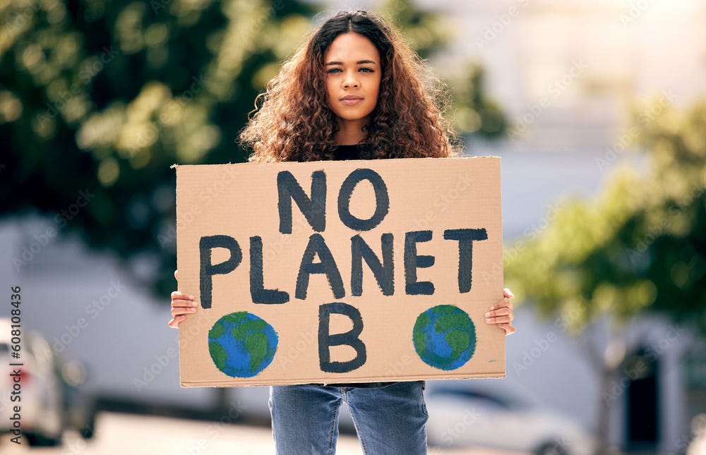
If the stock photos below were characters in a movie, they would be that cameo who had two lines at the beginning of the film but continues to show face for no apparent reason. The motif of human hands cradling the Earth and preachy ‘Save the Planet’ messages oversaturate our feeds on April 22, providing zero value (Stay tuned for my next article to learn more about the how the ‘hands holding Earth’ imagery came to be.)
With no legitimate target audience or call to action, we ask designers to slash the dilutive messaging and keep these files tucked in the draft folder.

4. For The Shellacked Activist
Trespassing on greenwashed territory, The Shellacked Activist could be incriminated for deception. Stock photos in this camp show volunteers taking some sort of action to benefit their communities or the planet. When used for marketing purposes, the curious viewer might wonder why a company wouldn’t show real photos of their people volunteering instead. Left to the imagination, one could assume they may not have any—and that more investment is plunged into green marketing than true corporate advocacy.
If that is the case, we recommend refraining from photos of this archetype.


5. For The Terrible, Horrible, No Good, Very Bad Marketer
This last selection of stock photos keeps me up at night. From my purview, marketers using these photos hardly know anything about sustainability beyond the color 'green.' It’s as if they took an existing product photo and edited in a leaf or tinted the background a shade of sage.
Even with little knowledge of the users (or designers) of these photos, I feel comfortable assuming they are doing nothing for the environment. Tag these photos with a scarlet (emerald?) letter.

So What Does a Good Earth Day Campaign Look Like?
Imagery from archetypes 3-5 in particular run a high risk of diluting a narrative and diverting your campaign straight into the eco-cosmic ether—especially on Earth Day. So if you are going to use stock—at least do it with an intent for impact.
A good Earth Day campaign, like any other strategic messaging or marketing effort, is rooted in a good (and honest) story. One that leaves a lasting impression and incites action.
Our Recommendation: Err on the Side of Boldness.
(even if that means saying nothing at all.) Some specific techniques could include:
Tap into dark humor.
Use bold colors, fonts, and narratives to counterbalance otherwise generic photography.
Contrast the aesthetic of how others in your industry are talking about sustainability.
Try avoiding the color green.
Lean into data visualizations.
Consider highlighting the ugliness of the environmental challenges we are facing as it relates to your company/industry (being careful not to be too ‘doomistic’).
Choose to heavily campaign on the environmental efforts of your company at a time of year OTHER than Earth Day/Week/Month.
Move beyond graphics; design real-world experiences.
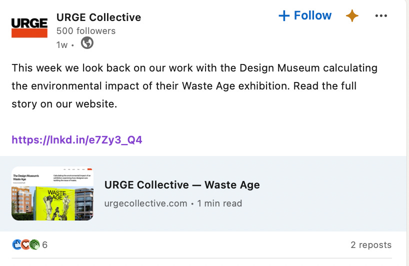
Bring attention to the environmental impact of your Earth Day campaign itself.
Here’s a few campaigns to take notes from:
As we continue uncovering ways to take action and talk about sustainability responsibly, remember that an image is worth 1,000 words. Make sure those images tell the good and honest story you want to relay and make the impact our planet deserves.
If you’re interested in support on your organization’s environmental messaging or climate design, Valerie and myself are happy to connect to support your journey.
* Earth Day Stock Photos <> Artificial Intelligence
Stock imagery is used to train artificial intelligence on what ‘sustainability’ and ‘environmental conservation’ look like. The images themselves, as well as their descriptions, influence new AI-generated art and responses to chat tool queries. Being the case, I challenge stock designers creating Earth Day content (and any other content for that matter) to take their responsibility seriously and use their power to mold the climate narrative for the better.
P.S. As a sustainability buff, I know this space is surely siloed and constantly evolving. All to say, I welcome your fact-checking and feedback! Working together to improve our collective understanding of sustainability is the goal of my page!
P.P.S. The views in this article are my personal perspectives and do not necessarily reflect the view of my employer or any other person or entity.
Subscribe to my Substack.
Book a call with me to talk climate marketing.
Connect with me on LinkedIn.


